
香港理工大學物料資源中心
VIS设计/教育、院校、科研
分享
发布于2022-06-30


心情
福建省 | 福州市 设计爱好者


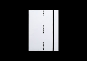
香港理工大學物料資源中心
Material Resource Centre of PolyU Design
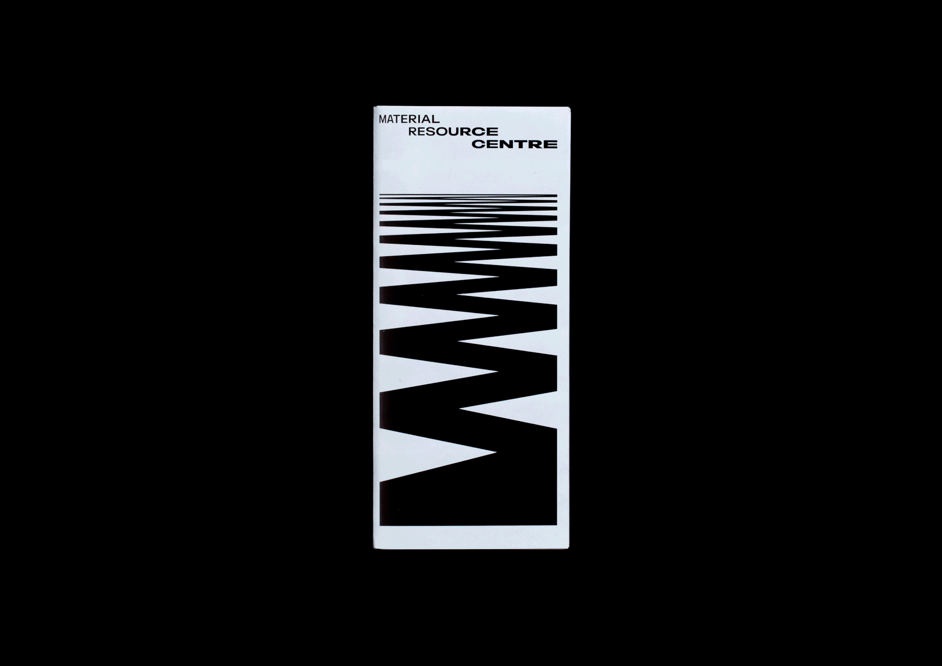
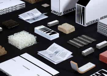
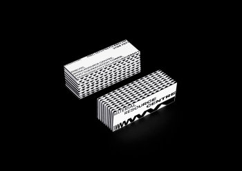
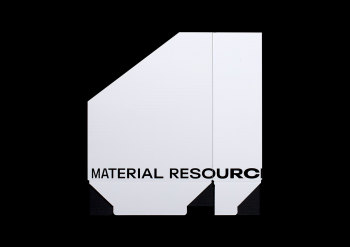
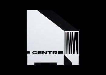
我們為香港理工大學物料資源中心(MRC)創造了新的形象識別系統,設計由一連串從幼至粗、窄至闊的「M」字組成。
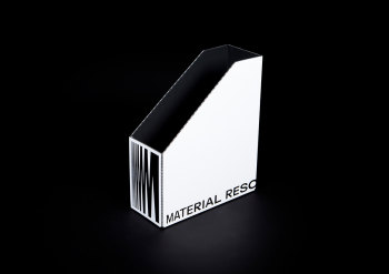
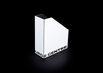
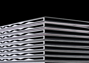
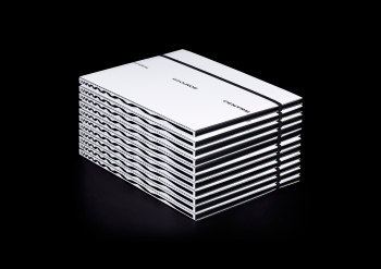
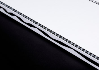
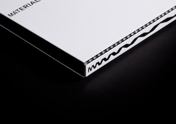
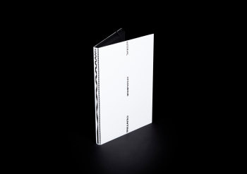
MRC 旨在提供世界各地設計及生產趨勢中與物料相關的研究和資訊,於這裏你可以發現多變的物料選擇。在標誌設計中選用Monotype的Neue Plak™可變式字型 (Variable Fonts)的概念亦由此而來。一系列使用可變式字型的「M」字代表物料(Material),從幼而窄、到粗而闊的連在一起,代表當中種類及選擇繁多,彷彿從一個極端覆蓋到另一極端。圖案整體形狀像彈弓,象徵MRC寄望能成為充滿活力且彈性的平台,探索各種物料的可能性。另外,我們亦選用以黑白瓦通紙製作卡片及文具,紙張之間的黑白空間呼應標誌的形態,形成獨特的視覺效果。
We designed a new brand identity for the Materials Resource Centre (MRC) of The Hong Kong Polytechnic University School of Design, which is represented by a continuous series of the alphabet letter ‘m’ from light to bold, narrow to wide font weights and widths.
MRC is a place to explore materials through the current trends in design, materials research, and productions from around the world. To illustrate the variety of choices in materials, the logo is designed with the variable font Neue Plak™ by Monotype. A series of the letter ‘m’ are linked together from light and condensed to bold and wide, covering from one end of the spectrum to the other. The overall shape resembles a coil spring, which expresses MRC's aspiration to become a vibrant, flexible platform from which one can explore the possibilities of various materials. Black and white corrugated papers are used to produce the business cards and stationeries. The space in-between the paper echoes the shape of the logo, forming a distinctive visual effect.
Client: Material Resource Centre of PolyU Design
Identity Design: Nous
Printing Production: ARS HK


-
发给
-
内容
心情
设计爱好者
关注
0
6939


批量入库
选择已有创意库
创建新创意库
描述:
- 请选择分类
新增创意库

