亮瞎你的氪金眼-CSS+SVG实现霓虹灯动画
往事的前篇的内容见这里
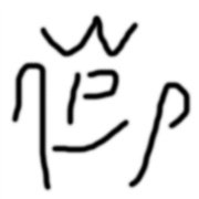
一、往事3
我的非常规操作让被拉进来的姑娘有些慌张,她清了清嗓子,用柔美却略带慌张的声音说道:“靓仔,这是你叫的服务,一共是24元。”我听后一愣,很快就反应过来,用我程序员的逻辑思维发现了这句话的两个破绽:1、还没提供服务呢,怎么就收钱;2、这服务也太便宜了,难道东莞是以价廉物美取胜吗?我沉着冷静的说到:“我还没感受到服务啊,难道看我的霓虹灯算提供服务?我的霓虹灯这么辣眼睛吗?”“不是你叫的艇仔粥和冰可乐吗?”“没有啊”“你这是404房吗”“不是哦,难怪会走错,不怪你,姑娘,404是很难找到正确地址的...我们程序员都懂的"
-------------------------强行的分割线又来了---------------------------
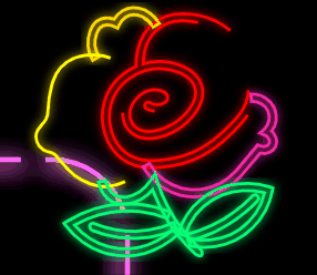
二、搞下“瑰”
我们先从简单的svg动画开始,因为这个动画在之前搞云的动画时用过,我就不多说了,直接上代码:
<text id="textbid" text-anchor="middle" x="62%" y="60%" fill-opacity="1" rotate="40" class="textb-front">
            瑰
            <animate attributeName="rotate" id="first" begin="0s;second.end" from="130" to="150" dur="1s"></animate>
            <animate attributeName="rotate" id="second" begin="first.end" from="150" to="130" dur="1s"></animate>
        </text>
其实就是控制”瑰“的旋转角度(rotate),造成一个晃来晃去的感觉,最终效果是这样的
但以为对霓虹灯多年的观察,一般这种脱离的灯都会伴随接触不良的问题,而且这种黑漆漆的谁看的见,我要让每个字都要有高光时刻
.textb-front {
            font-family: YouYuan;
            font-size: 64px;
            font-weight: normal;
            text-transform: uppercase;
            stroke: #340547;
            stroke-width: 1px;
            stroke-dasharray: 180 280;
            animation: grow 2s infinite;
        }

 @keyframes grow {
            50% {
                stroke: #f4f2f5;
                stroke-width: 2px;
                text-shadow: 0px 0px 5px #adabad;
            }
 }
知识点啊(敲黑板)
1、@keyframes 顾名思义,关键帧。在animation需要有重要变化的时候,就要设置关键帧来配置好属性,这样animation才知道到什么时候改怎么变化,50%这个就是说在animation运行到50%的时候要变化的内容。
2、animation,css动画的两兄弟之一,另外一个是transition(过渡)。animation强调流程与控制,对元素的一个或多个属性的变化进行控制,可以有多个关键帧(animation 和@ keyframes结合使用)。
3、grow 2s infinite 我们这次animation里面的三个参数,grow就是指animation用到的@keyframes的名字(animation-name),和 @keyframes grow {...}对应;2s是参数animation-duration,表示这个animation需要运行的时长;infinite是参数animation-iteration-count的值,这个参数是设置动画播放的次数,我们这边是无限循环,所以用infinite;
具体关于animation的了解,可以自行查阅这里,最后看到的效果如下:

三、采个花
上次做静态霓虹灯的时候除了“瑰”字,花也做了残缺化的处理,残缺证明电路还是有问题,所以动画化也不能放过啊
@keyframes flicker {
            0% {
                opacity: 1;
            }

            3% {
                opacity: 0.4;
            }

            6% {
                opacity: 1;
            }

            7% {
                opacity: 0.4;
            }

            8% {
                opacity: 1;
            }

            9% {
                opacity: 0.4;
            }

            10% {
                opacity: 1;
            }

            89% {
                opacity: 1;
            }

            90% {
                opacity: 0.4;
            }

            100% {
                opacity: 0.4;
            }
        }
这次 @keyframes 设置了更多的关键帧环节,然后把它用到了花(svg)的两个path的class里面
.svg-font1 {
            fill: none;
            stroke: red;
            stroke-width: 10;
            stroke-dasharray: 880 330;
            animation: flicker 5s infinite 3s step-end;
        }
.svg-font5 {
            fill: none;
            stroke: rgb(7, 252, 117);
            stroke-width: 10;
            animation: flicker 6s infinite step-end;
        }

<path class="svg-font1"...
<path class="svg-font5"...
这次我们看到了animation更多的参数:
1、3s,这个是animation-delay参数的值,表示动画开始的时间,两个动画的时间,我一个设置了3秒,一个没有设置,这样可以让动画错开,显的真实。
2、step-end,这个比较复杂,有大佬的文章在,我就不多言了。请移步学习
最后看到的效果是这样的:
四、弄下框
框我希望实现的是能够体现视觉上向前滚动的效果,用的仍然是animation和keyframes的组合,看代码:
.rect-front {
            animation: rectchange 6s infinite step-end;
 }
@keyframes rectchange {
            0% {
                stroke: #c0f015;
                stroke-width: 2;
                stroke-dasharray: 40 10;
                stroke-dashoffset:0%;
            }
            25% {
                stroke: #ff66ff;
                stroke-width: 2;
                stroke-dasharray: 40 10;
                stroke-dashoffset:25%;
            }
            50% {
                stroke: #00EE00;
                stroke-width: 2;
                stroke-dasharray: 40 10;
                stroke-dashoffset:50%;
            }
            75% {
                stroke: #3358ff;
                stroke-width: 2;
                stroke-dasharray: 40 10;
                stroke-dashoffset:75%;
            }
            100% {
                stroke: #c0f015;
                stroke-width: 2;
                stroke-dasharray: 40 10;
                stroke-dashoffset:100%;
            }

        }

<rect id="rectid" x="12%" y="41%" rx="30" ry="30" width="340" height="90" fill-opacity="0" class="rect-front" />
这里唯一的新东西是stroke-dashoffset,作用是相对于绘制的起点偏移的量,正值(向右或者顺时针偏移),负值(向左或者逆时针),和stroke-dasharray配合在一起,通过keyframes设置不同的偏移量,就能达到线框在不停走动的效果了。


五、弄下字
字的动画其实是使用stroke的描边,代码如下:
.texta-front {
            font-family: YouYuan;
            font-size: 64px;
            font-weight: normal;
            text-transform: uppercase;
            fill-opacity: 0.3;
            stroke-width: 2px;
            stroke-dasharray: 90 310;
            animation: text-stroke 6s infinite linear;
        }
.text-1 {
            stroke: #3498db;
            text-shadow: 0 0 5px #3498db;
            animation-delay: -1.5s;
        }

        .text-2 {
            stroke: #f39c12;
            text-shadow: 0 0 5px #f39c12;
            animation-delay: -3s;
        }

        .text-3 {
            stroke: #e74c3c;
            text-shadow: 0 0 5px #e74c3c;
            animation-delay: -4.5s;
        }

        .text-4 {
            stroke: #9b59b6;
            text-shadow: 0 0 5px #9b59b6;
            animation-delay: -6s;
        }

        @keyframes text-stroke {
            100% {
                stroke-dashoffset: 1500;
            }
        }
......
<svg>
<text id="textaid" text-anchor="middle" x="35%" y="60%" fill-opacity="1" class="texta-front text-1">
            巴黎の玫
        </text>
        <text id="textaid" text-anchor="middle" x="35%" y="60%" fill-opacity="1" class="texta-front text-2">
            巴黎の玫
        </text>
        <text id="textaid" text-anchor="middle" x="35%" y="60%" fill-opacity="1" class="texta-front text-3">
            巴黎の玫
        </text>
        <text id="textaid" text-anchor="middle" x="35%" y="60%" fill-opacity="1" class="texta-front text-4">
            巴黎の玫
        </text>
</svg>
再说知识点(黑板已敲烂):
1、每个svg里面的text代表一种颜色,有多少个同样字的text就有多少种颜色动态描边,颜色设置在text-1(2,3,4)里面
2、animation-delay的意思上面提到过(还记得吗),是延迟动画开始时间,这样可以让不同颜色的描边动画错开,看起来就像不同的颜色在各自描边了
3、stroke-dashoffset: 1500; 这个上面刚刚讲过(你肯定记得),是用来设置偏移量的,这里就是设置描边的整个长度,因为动画从开始到结束,就是从0走到偏移量数值终点的过程。因为动画的时长是确定的,所以这个数字有个有意思的作用,时间相同,路径越长,那么过程中动画播放的速度就会越快,所以这个数字越大,描边的速度看起来就越快,大家可以试下。
最终的效果是这样的:


到此为止,上一章的内容全部都动画化了,大家都散了吧。
--------------------------------------散场字幕分割线-----------------------------
------------------------------------剧务:我------------------------------------
-------------------------------------售票:我(欢迎打赏)-------------------------
-------------------------------------剧本:我-----------------------------------
------------------------------------扫地:我------------------------------------
------------------------------------杂事:我------------------------------------
------------------------------------本剧终--------------------------------------
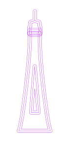
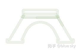
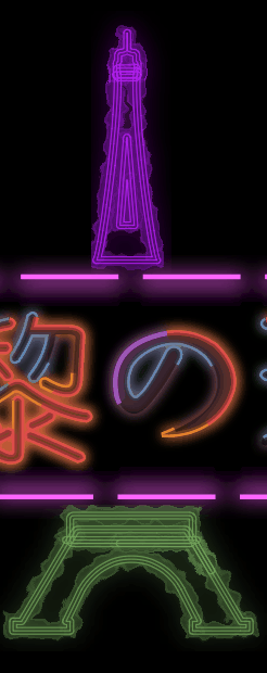
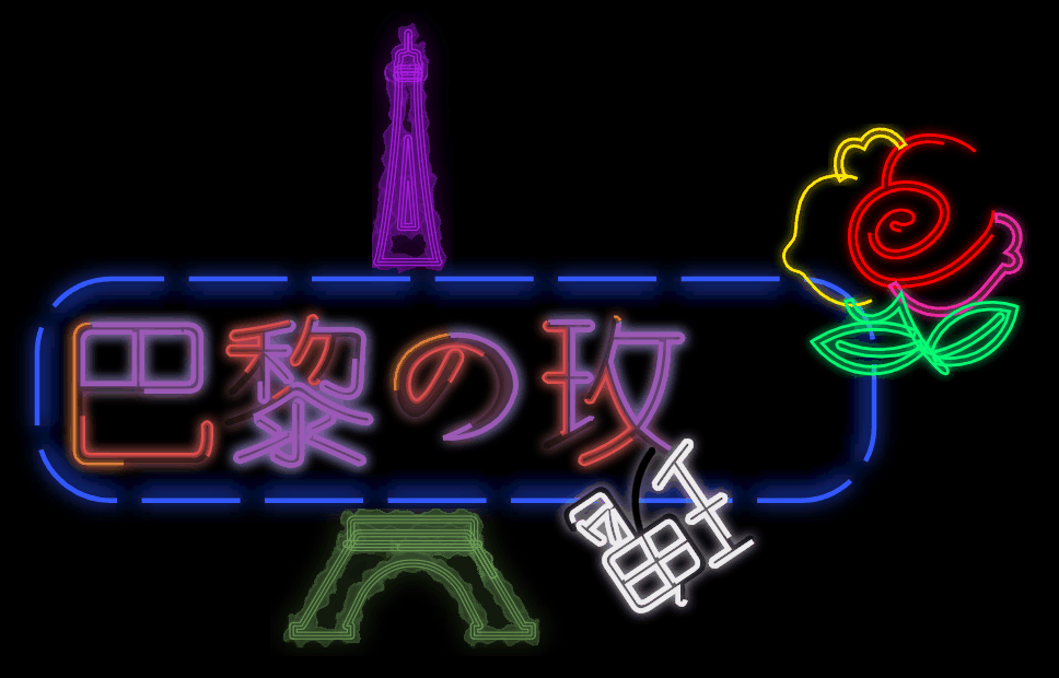
六、埃菲尔铁塔
留下来的都是喜欢漫威电影的同学,知道字幕完了还有彩蛋。巴黎的玫瑰,只有一朵玫瑰,谁知道这是哪的玫瑰,万一是东莞的呢,为了看起来更贴近巴黎,我决定再加一个埃菲尔铁塔。
我先从Iconfont-阿里巴巴矢量图标库获取一个埃菲尔铁塔的svg文件。


然后我用工具把它一份两半,分成上下两个部分,方便和之前的霓虹灯招牌融合(此段没有技术含量,完全是一个艺术家在考虑创作,请大家瞻仰,谢谢)
然后要开始用到svg的filter
<svg>
<filter id="glow">
            <feGaussianBlur id="glowBlur" stdDeviation="1" result="coloredBlur" />
            <feMerge>
                <feMergeNode in="coloredBlur" />
                <feMergeNode in="SourceGraphic" />
            </feMerge>
        </filter>
        <filter id="shock2">
            <feTurbulence type="fractalNoise" baseFrequency="0.2" numOctaves="1" seed="2" result="noise" id="noise">
                <animate attributeType="XML" attributeName="seed" from="2" to="120" dur="10s"
                    repeatCount="indefinite" />
            </feTurbulence>
            <feMorphology id="morph3" in="SourceGraphic" operator="dilate" radius="1" result="morph1" />
            <feMorphology id="morph4" in="morph1" operator="dilate" radius="1" result="morph2" />
            <feComposite operator="out" in="morph2" in2="morph1" result="strokeText" />
            <feDisplacementMap xChannelSelector="R" yChannelSelector="G" in="strokeText" in2="noise"
                result="displacementMap" color-interpolation-filters="sRGB" scale="10" />
            <feGaussianBlur stdDeviation="5" result="coloredBlur" />
            <feMerge>
                <feMergeNode in="coloredBlur" />
                <feMergeNode in="displacementMap" />
            </feMerge>
        </filter>
</svg>具体的filterd组合怎么用,in,out怎么弄,我就不详述了,因为这是艺术(呸,就是调参数的体力活)。大家有能力可以去油管看这个视频,是讲filter的,翻这里。
然后用一个新的做法把filter关联到svg的图像去
<use xlink:href="#tietaupid" id="textShock" x="2" y="2" filter="url(#shock2)" stroke="0" stroke-width="3"
            fill="#FFFF00" />
        <use xlink:href="#tietaupid" id="textFill" x="0" y="0" fill="white" />
        <use xlink:href="#tietaupid" id="textGlow" x="0" y="0" filter="url(#glow)" stroke="#f90" stroke-width="0.1"
            fill="transparent" />

        <use xlink:href="#tietadownid" id="textShock" x="2" y="2" filter="url(#shock2)" stroke="0" stroke-width="3"
            fill="#FFFF00" />
        <use xlink:href="#tietadownid" id="textFill" x="0" y="0" fill="white" />
        <use xlink:href="#tietadownid" id="textGlow" x="0" y="0" filter="url(#glow)" stroke="#f90" stroke-width="0.1"
fill="transparent" />use元素是SVG中非常强大,非常重要的一个元素,尤其在Web开发中,为何?
两点:
- 可重复调用;
- 跨SVG调用;
这里用到的就是可重复调用,我们通过use,把多种的filter叠加到svg图像里面。filter里面再使用animation,就达到了效果。
七、往事4
“我看的是04房啊”,姑娘疑惑的看着我,觉得我对房号似乎有特别的理解。“我这边是404的楼上,504”,我接着说:“所以服务错误很正常,这属于服务内部错误,我的问题”。我又露出了特别的微笑。“那么,对不起,我去404了。”“不要急嘛,看一下我能动的霓虹灯,这次,可高级了"
窗外,霓虹灯闪烁的更频繁了....

源码请看这里
大家如果想线上看效果,也可以访问codepen